Basic Resources
In this section you’ll find the basic resources we use to give our brand a voice. The templates already contain many of these elements, but this section will help you to understand how to properly use them.
Using IE University’s Logo
Logo versions
Due to the wide variety of formats that have been developed, we use the two versions of our logo: horizontal and vertical.
Horizontal logo version / Positive
Vertical logo version / Positive
Horizontal logo version / Negative
Vertical logo version / Negative
LOGO MARGIN
IE University’s logo must always be surrounded by a margin so that texts and other visual elements do not interfere with it. This ensures that our logo always appears clean, clear and unobstructed. Use the dot on the “i” in the logo as a point of reference for this margin.
Horizontal logo
Vertical logo
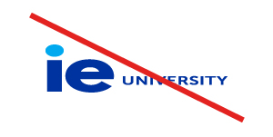
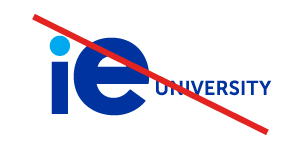
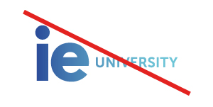
INCORRECT USES
Under no circumstances may IE University’s logo be applied in the ways stated below. These incorrect uses are also prohibited for the vertical version of the IE University logo:
Do not modify logo proportions.
Do not modify logo components.

Do not use effects.
Do not use gradients.
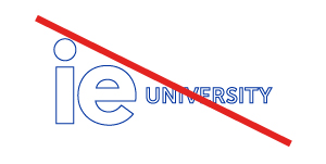
Do not outline the logo.
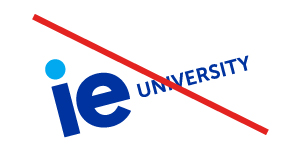
Do not rotate the logo.
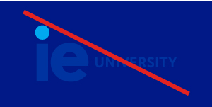
Do use sufficient contrast.

Do not create new logos.
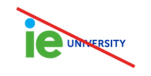
Do not alter logo colors.
Color
PRIMARY COLOR PALETTE
This color palette is our basic visual feature and represents an important part of our brand personality. It must always be present in our designs.
Blue principal
RGB 0,50,160 / HEX #0032A0
Light Blue principal
RGB 0,170,240 / HEX #00AAF0
SECONDARY COLOR PALETTE
The colors below should be combined with colors from the primary in order to differentiate publications depending on the profile we are targeting.
Blue Dark
RGB 0,0,102 / HEX #000066
Light Blue
RGB 0,30,85 / HEX #A0DCFA
Gray
RGB 227,227,226 / HEX #E3E3E2
COLOR COMBINATIONS BY PROFILE
Below are the color combinations associated with each profile. The same combinations apply for backgrounds or lines that interact with content.
Young professional
Professional
Executive
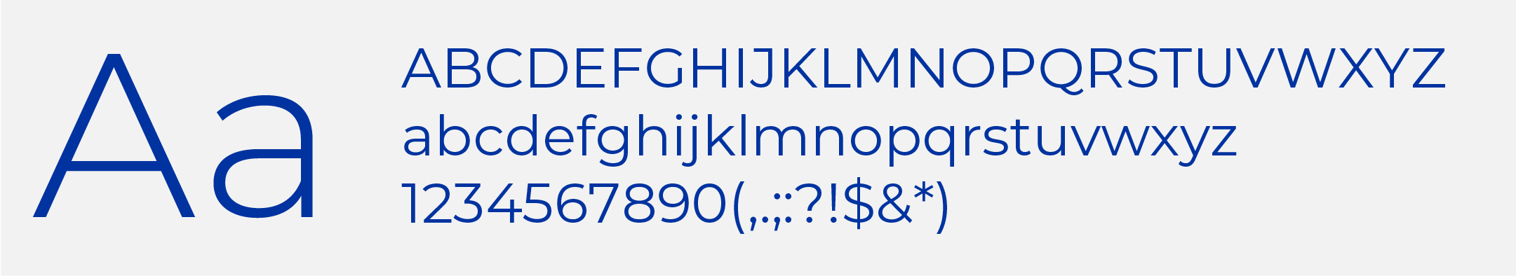
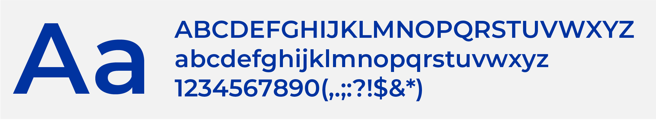
MAIN FONT
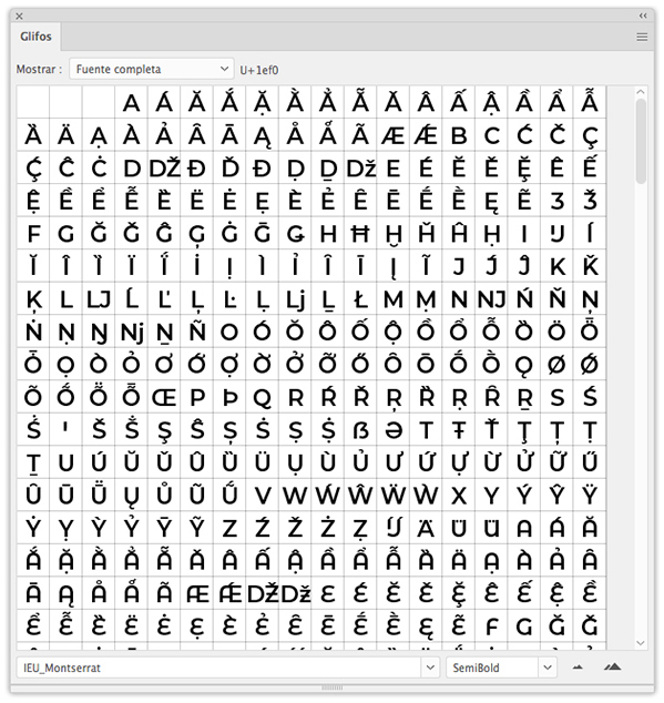
Our main font is Montserrat. This font family contains many variants, but we will mainly use Light and SemiBold. If you need assistance, feel free to consult the style guides. These can be found in the library available for download below.
IEU Montserrat / Regular
IEU Montserrat / SemiBold
SPECIAL CHARACTERS
To facilitate the use of icons in publications, we have included new characters to represent the place, time, language and format icons within the Montserrat font. To use them, you have to access the character palette in the above-mentioned source. To edit animations, the original Montserrat font (Google Fonts) must be used due to source compatibility issues with Adobe After Effects (to do so, download the source and install it on your computer).
New glyphs
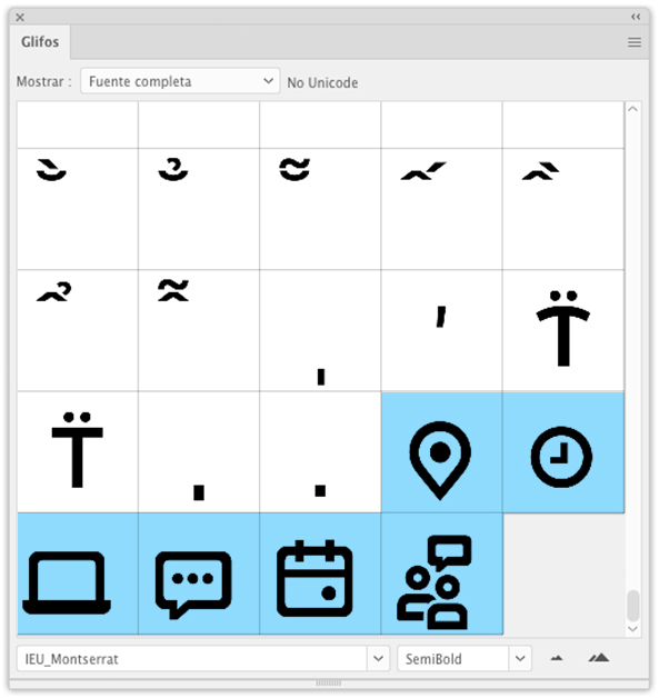
New glyphs / Detail
Library
EASY ACCESS TO RESOURCES
We have created a library that contains all of the basic resources needed to adapt creative content. This library contains logos, colors, text styles, icons, reticles, etc. To install it, simply import it into your workspace to integrate it into your software.
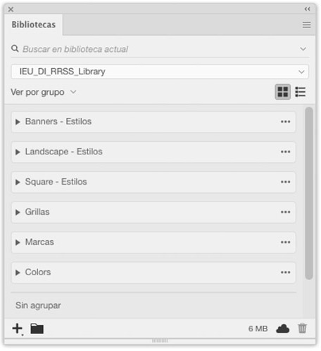
Library / Different Graphic Resources Groups
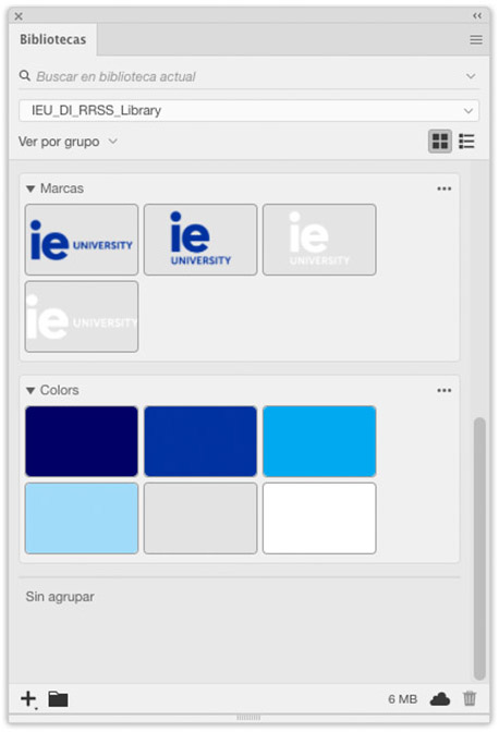
Library / Different Graphic Resources Groups
Photos
Below is a selection of images for each profile and activity. If you are using one of these images for printing, please remember to check its resolution and convert the color format to CMYK.
Young professional

Photos / Young Professional
Professional

Photos / Professional
Executive

Photos / Executive